Zkool currently has two report charts[1]. Both of them can be limited to a given time period.
Important
Due to some technical issue, charts are not available on Linux.
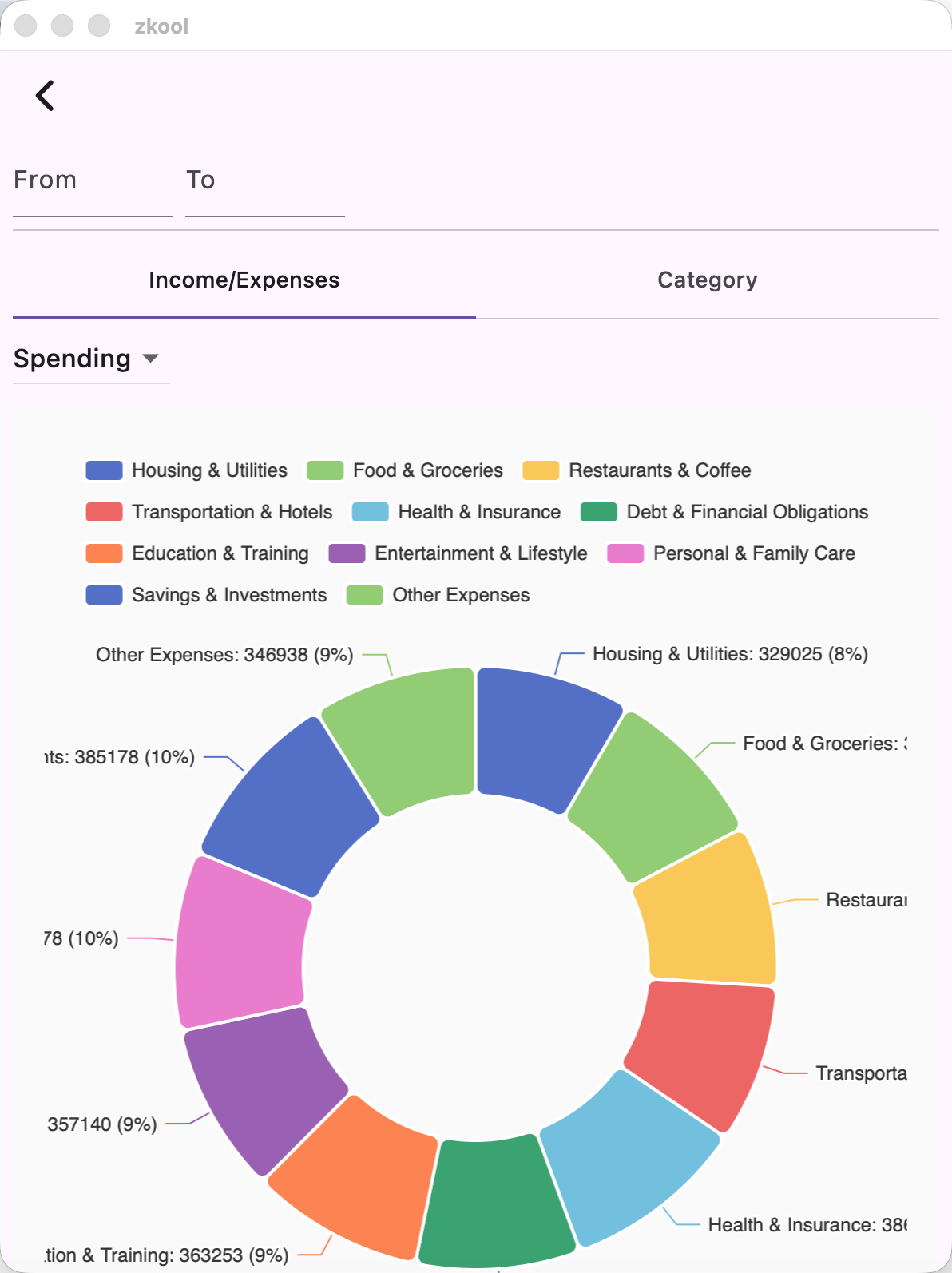
Income/Expense By Category
This is a pie chart that shows your total of income or expenses by category.
- Switch between Income and Expenses with the dropdown.
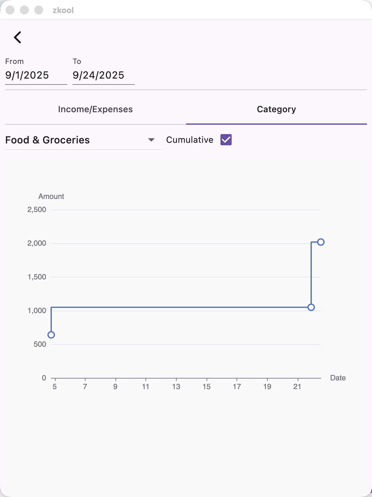
Category by Time
Given a category, this chart plots your spending (or income) on a time axis. If the cumulative box is checked, it shows how the total amount in the given category grows over time.
More charts will be added later. ↩︎